|
latest table on contents: https://www.harpersbazaar.com/fashion/trends/g16669590/fall-2018-fashion-trends/?slide=33
First magazine cover: https://www.revelist.com/celebrity/bella-hadid-another-nip-slip/11327 Latest magazine cover: https://news.google.com/publications/CAAiEC2pRijlkJGd1wWSfoohh5YqFAgKIhAtqUYo5ZCRndcFkn6KIYeW?ceid=CA%3Aen&gl=CA&hl=en-CA latest double page spread https://ca.movies.yahoo.com/bella-hadid-got-chunky-highlights-182501622.html?guccounter=1&guce_referrer=aHR0cHM6Ly93d3cuZ29vZ2xlLmNvbS8&guce_referrer_sig=AQAAAEWgfKevHDdTni7yEfDP0kWC1BzLRBHLUsryKziMWULJ2pPkZ5R9RXpmQh8948nGJHnW5PFqRMDh8NwHY3qmnPAVruvYSdltAdAulK8NYp7L0TSBVOq1qsDcdPnArNgHx6IWcGx1W8XDXIYCKZAFaZycoDpBQ6kEONoBODu9MqhX
0 Comments
https://docs.google.com/presentation/d/1Vpxrw_kB_-R7c08lQV2T8UQRREJ4TA6Uo30gToJyf9g/edit?usp=sharing
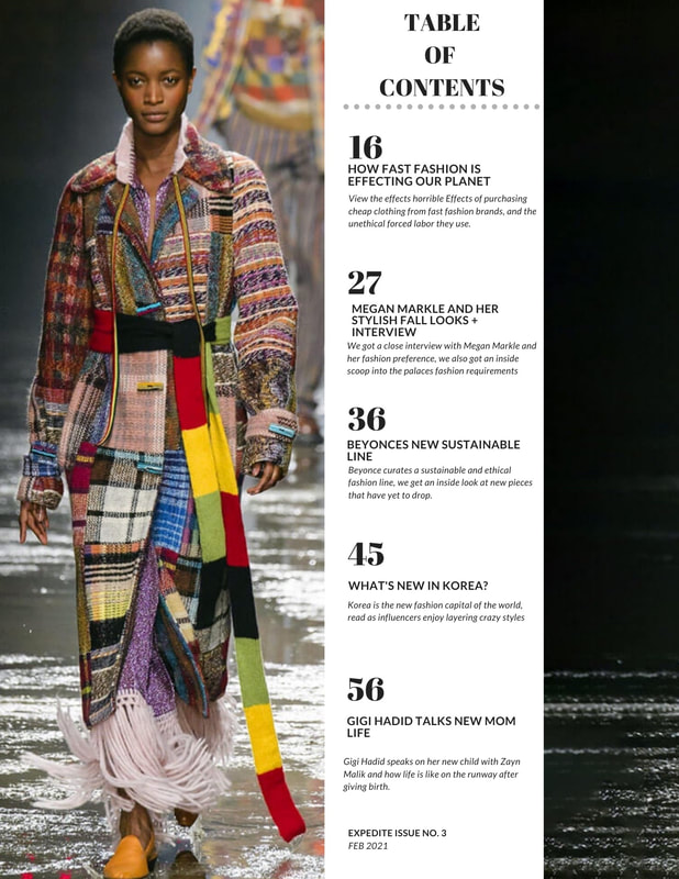 Comparing my latest table of contents to my first one nab things have changed. I have added more color, to brighten up the page and attract readers. As well as add more enticing titles with more of a description compared to my first version. I was satisfied with my latest version on have seen the growth between both versions and now have a better understanding of what is more appealing to readers. I was able to keep the black and white all while enhancing the vision I had for my table of contents before.
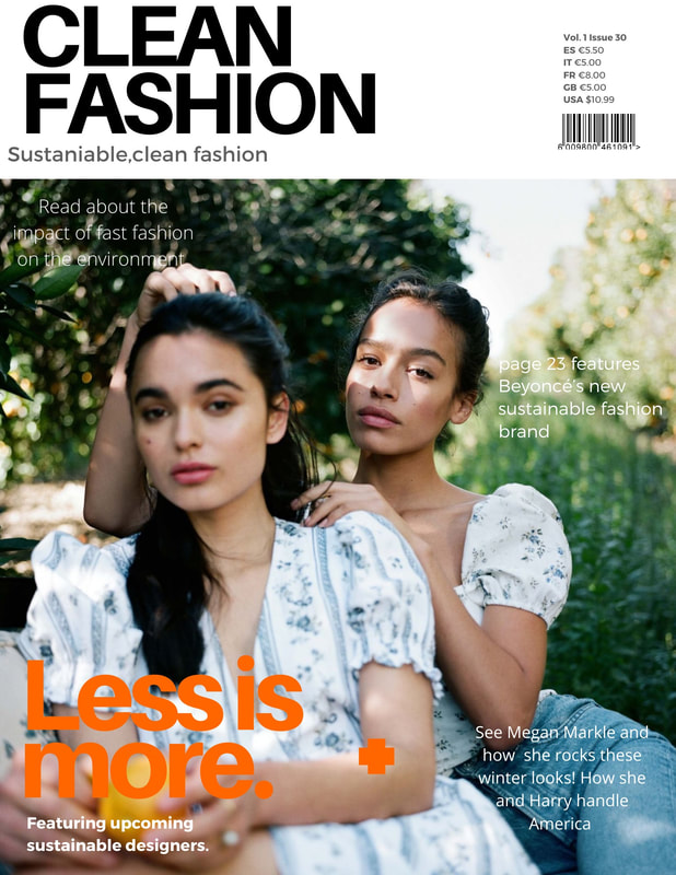 My final magazine cover was drastically different from the first one I had made.The colors were brighter, I had better headline placement, as well as use a more enticing picture that was more on brand for the visual aesthetic. These changes helped me go from a bland magazine cover to one that best perceived as interesting and fun.
|
|
 RSS Feed
